DC's new Absolute Universe has been one of the most interesting things the company has done in recent years and fans are always eager to get more details on these new versions of iconic characters. When Absolute Superman was revealed, almost everyone commented on the killer new design, which is why it's even more shocking that its design was almost completely different.
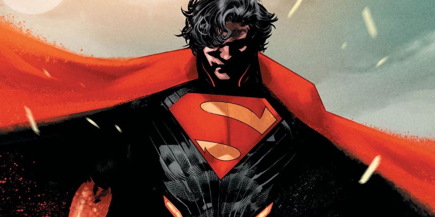
Absolute Superman is one of the coolest designs in the Absolute Universe so far. Sporting frizzy hair and a much darker attire, including a cape that is supposedly made from the ashes of Krypton itself. It's an incredible design that immediately caught attention. But it was recently revealed that it wasn't the design that Absolute Superman was originally going to have.
It appears that the original artist of Absolute Superman Number 1 was supposed to be Rafael Albuquerque, but he had to withdraw due to the floods that affected the region where he lives. This led to the art being taken over by Rafa Sandoval, and while the designs they are similar, they are not exactly the same.
Absolute Superman's design has undergone some changes
Absolute Superman #1 by Jason Aaron, Rafa Sandoval, Ulises Arreola and Becca Carey.
Absolute Superman's current design is great. The face is robust, with a rough appearance and unshaven and curly hair. His arms end in an almost flaming pattern and his cape has an ethereal grayish appearance. It's a wonderful look and makes him instantly recognizable from Prime Universe Superman. While Absolute Superman's current design is certainly great, there is something to be said for Rafael's original design. Neither is necessarily better than the other, but it's always interesting to see an original character design that readers almost got.
It could be a really cool trick to show how charged Superman is with the yellow light of the sun, literally having the fire of the sun inside him.
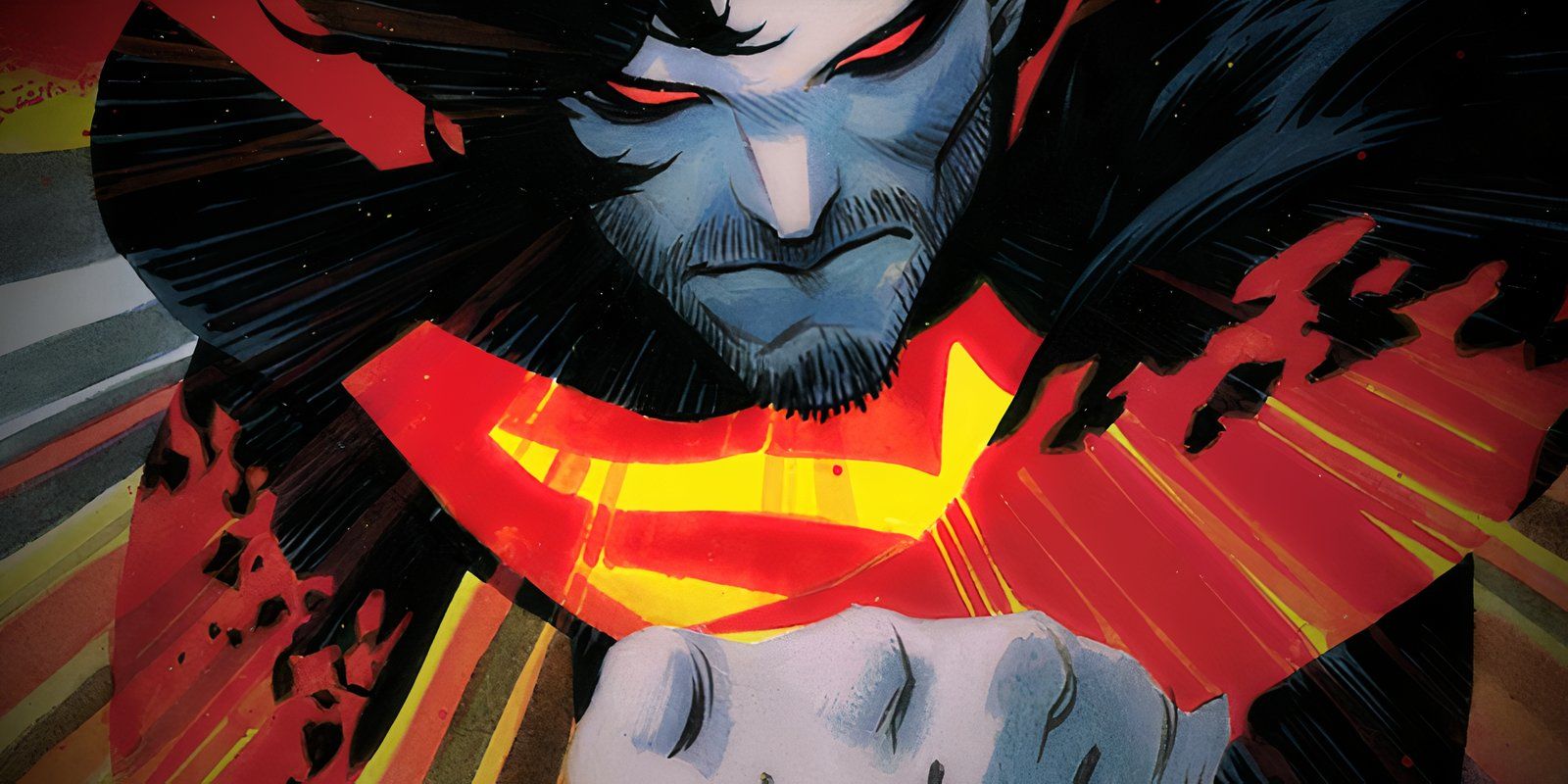
Rafael's design is very similar to Rafa's. It's clear that Rafa was inspired by Rafael's original design, but took it in a different direction. Rafael's design has a much more fiery appearance, with Superman almost having a melted appearance to his suit, with glowing red lines on his forearms and sides. It could be a really cool trick to show how charged Superman is with the yellow light of the sun, literally having the fire of the sun inside him. There's also no cape to speak of in these sketches, just a ghostly red aura around him.
Absolute Superman's designs were all amazing
After the great success of Absolute Batman #1, Absolute Superman #1 is one of the most anticipated comic book releases yet. It's a complete reimagining of Superman's iconic origin, and for starters, it'll have an all-new design. DC has been proudly showing off the new look that Superman will be sporting, and it's a fantastic look. But if things had turned out a little differently, this version of Superman it would look a little different.
Source: methodical_trip
